For this project, I utilized light room in order to enhance the moods in images, so as to create a certain feeling in the photo. I also created grids using contrasting colors because it draws the viewer to the picture and attracts their view.
 |
| This grid is made up of a single photo whose color I changed to black and red, and rotated, to make a checkerboard grid. I like this photo because the contrast between the red and the black it very intense and draws my eye to it. |
 |
| This photo is a single picture of a bridge I took, whose colors I changed, and formed into a circular pattern. I changed the colors of the bridges to create the color circle, and then used that to create a larger color circle that incorporates a lot of tones. It also draws my eye because it appears to be slanted because of the positioning of the bridges, and forms a broken up square, which draws my eye. |
 |
| This is a picture of a tree took, which was really contrasted against the cloudy sky. I then took the photo and rotated it and darkened it to form a circular pattern. However, I left a slight space between the photos because it reminded me of a target. |
 |
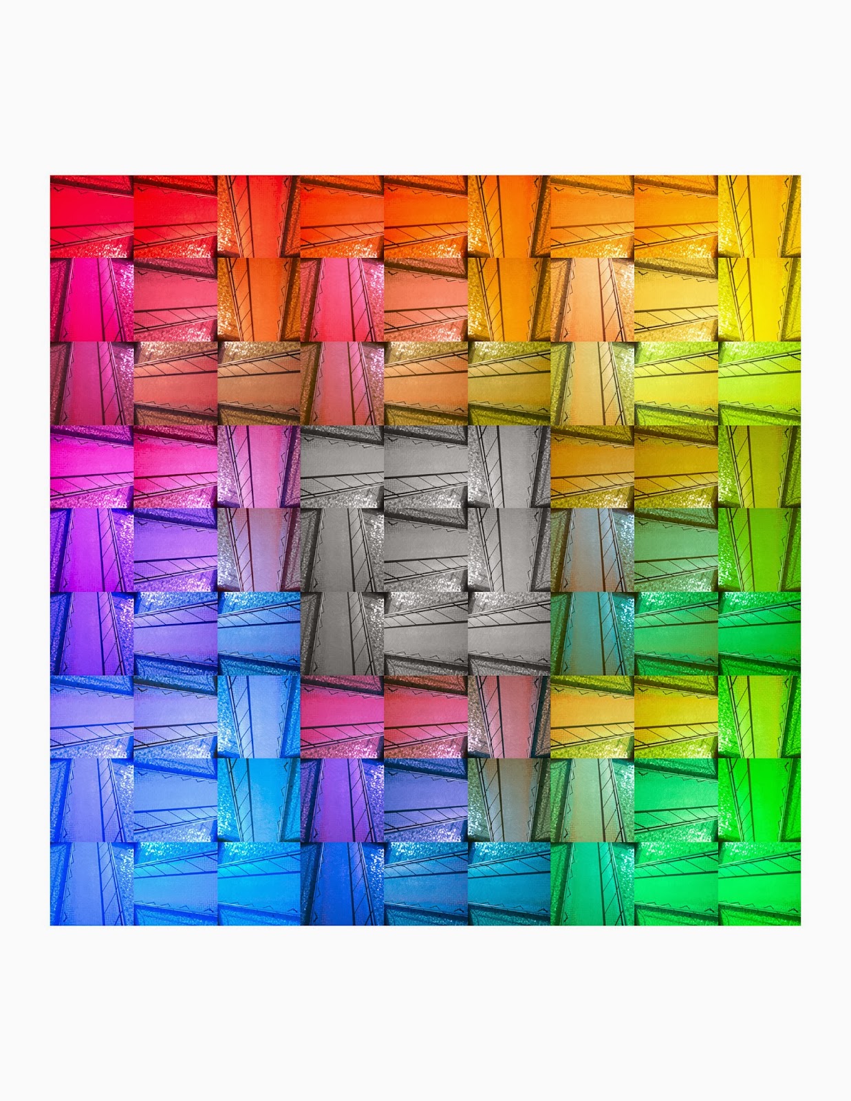
| This grid is composed of 9 grids of a 9 grid lampost grid. Then I changed the contrast and blacks of each of the photos and mixed them up to create a random series of different colors which slightly confuses me, which I like. I also really like the original pattern of the lampposts and it creates a very cool pattern. |
 |
| This is a grid of 9 photos of a single flower at different positions of the flower, put together to recreate the flower. Then I changed the color of the flower to make it a happier picture. I really enjoy the way that the pictures fit together from different angles, because it puts together a single image using different views, yet you can still see what the overall image is. |
 |
| This is a monochrom grid constructed from images of the sky I took in the hoods of different colored cars. Then i changed all the images to a brownish color because it makes me think of a desolate, destroyed town, which I believe fits the image content because the hoods of the car warped and twisted the images, giving it a very absurd look.I then shaped the image into a square facing inwards, as if the viewer is looking up, surrounded by all these, dark, ominous buildings. |
 |
| I really like this grid of a statue because it reminds me of monkeys in a barrel in the way that they are connected I really like the square pattern formed by their hands, and the act that it is not a symmetrical grid. |
 |
| I really like this picture because of the tone I gave it. I gave it a blue tone, and darkened it a lot to give it a very weird look. It makes it seem very unreal, sort of as if it were in a dream, which I like because it fits the image content of Alice in Wonderland. The colors make me feel kind of alone and lost which is what Alice was feeling when she get lost in Wonderland. |
 |
| This is another grid composed of a single picture, colorized and shifted to create a cross pattern. The colors of a purple-red and yellow provide a lot of contrast which helps the pattern of the crosses come out. This is one of my favorite pictures because of how intricate the pattern is. At first you can see the cross, but then you can see the square surrounding it, or the many litte patterns of the cross with circles around them, there are just so many different patterns you could see in this, which is what I like about the photo because it allows for a lot of diference in interpretation. |