This is a collection of my favorite pieces I made throughout of the year in Digital Photography. This year has really taught me about photography and how to compose pictures. I especially enjoyed how the projects varied in this class because it allows me to experiment with different artistic styles and see which ones I like the best. My favorite projects were the diptych and triptych projects, as well as the magazine project because I enjoy editing the photos a lot. This class had helped me come to really love and appreciate photogaphy and all art as a whole. View my slideshow here.
Monday, June 9, 2014
Monday, June 2, 2014
Thursday, May 8, 2014
Magazine Project
For this project, I created a fake magazine and took pictures for ads and articles in the magazine. The magazine that I chose was TIME magazine, and I created three ads as well as two photo spreads.
 |
| This is the cover of my magazine and I used an image of Kyle with his mouth covered in tape because I feel that it matches the themes that are often presented in TIME magazine. |
 |
| This is a spread about the situation in Crimea, and it doesn't actually use very much photography, it is mostly photoshop to create the idea that the United States is saying that it is still allied with Russia, even amidst the situation in Crimea. The other image is a black and white image of the hallway to give it a desolate feel that I was trying to create in the magazine. |
 |
| This is a multiple image ad that is for Embark chairs. I used images of people in chairs and saturated the a lot in order to give the feeling the sunshine and happiness, which is conducive to people buying the chairs. I used a cursive looking font to represent how the chairs are sophisticated and elegant. |
 |
| This Nikon ad is in black and white to highlight the yellow Nikon words as well as give the sense of being very classy. The Nikon words are in a font similar to the actual ad, and the capture the moment is a different font because the font makes the words stand out and are almost italic which makes the words seem as if they are important. |
 |
| In this photo of Kyle, I highlighted the contrast between the light and the dark backgrounds to make Kyle stand out, and I used red and white font on a black background to also make the words stand out, and so that people can easily differentiate between the questions and the words. |
 |
| In this photo, I increased the exposure intentionally to make the picture very bad, which highlights the need for Adobe Photoshop. The black standard font really pops from the white background and draws the reads eyes. |
Tuesday, April 22, 2014
Photoshop on Photoshop on Photoshop
 |
| This is an image that represents the situation in Crimea currently, and I created it using photoshop to input country flags over the body of a person. This image represents how the US is trying to remain allies with the Russians superficially, but they actually seem to be taking a big interest in the Crimea situation, which is represented by the Ukrainian flag in the background, the UN symbol, and the way that the people are arranged in an agressive formation. |
Thursday, April 17, 2014
FIne Art Portraits and Magazine Cover.
 |
| This is a fine art portrait I took of my friend Bailey. I asked him to do his "fine art portrait pose" and then I edited the photo into black and white. I really like the image because the background was especially interesting, I had him sit against the school lockers, which are scratched and beat up, which also makes me connect with the image because it is something that I see every day when I walk down the hallways. |
 |
| This Fine art image is of Kyle McNeil taken in front of a black piece of paper so that he would stand out, because he was wearing a black shirt. The black background also makes the red and green in the flower stand out in contrast form the rest of the image. I edited the image to be darker and also added a texture to the top of it to make the image seem more gritty, and make the large amonts of black space more appealing. |
 |
| This is a fine art self portrait I took. I liked it because of the contrast between the rough background and my face, as well as the way that the pattern of the shirt really contrasts the background. |
 |
| This is a commercial portrait taken of Kyle with tape over his mouth to represent the lack of voice that people have these days. This photo was also taken against a black background so that kyle's face is in sharp contrast. The black and white as well as the pose of kyle help to give a mood of bleakness, which fits in with the theme of the articles in the magazine. I emulated a Time Magazine cover because the image seemed very serious, which fits best with the political articles that time magazine often runs. |
Monday, April 14, 2014


Tuesday, April 1, 2014
Portraits
There are generally two types of portraits: commercial portraits and fine art portraits. Commercial portraits are images taken by photographers who are hired to do a specific photo shoot that the employer wants. These commercial portraits are generally used for magazine shoots. The other type of portrait is a fine art portrait, which is simply a portrait that a photographer takes for the sake of taking a good picture. This portraits are used to highlight the beauty of the subject, and are therefore sometimes used for magazines about fashion.
 |
| Diogo Pereira. |
 |
| Eva Miliunieve. |
 |
| I like this magazine cover because of the use of posing to highlight the movement in the image, which especially supports the topic of the magazine cover. It makes it seem as if Mohammed Ali is actually throwing a punch at the viewer, which makes a very interesting magazine cover. The line of his arm is additionally very well utilized to lead the viewer's eyes to the headline of the magazine. |
 |
| I really like this image because the composition is excellent in supporting the topic of mockery of the magazine. The colors are are very vibrant against the plain white background which also helps the viewer focus simply on the subjects. The use of props like the typewriter and the positioning of the man on the right, help make the image humorous and makes me want to read the article. |
Thursday, March 20, 2014
Alternative Photography Techniques
For this project we experimented with different types of photo techniques such as panoramas, HDR photos and multiple perspective images. Multiple perspective images are images that are made of combined photos from different perspectives of a single object which are then layered on top of each other. An HDR photo, which stands for a high dynamic range photo, is a photo that is made of multiple exposures of a single image so that by using a low exposure you can highlight the shadows and by using a high exposure, you can see the bright spots, and when they are combined the image represents a full range of both shadows and areas of light.
 |
| Forest Panorama. In this image I took multiple photos in Forest Park and merged them together in light room and edited the vibrancy and saturation of the image to highlight the images in the sunset. |
| This is an image I stitched together from images I took in a parking area. I then edited the color to be more vibrant and stand out from the background. |
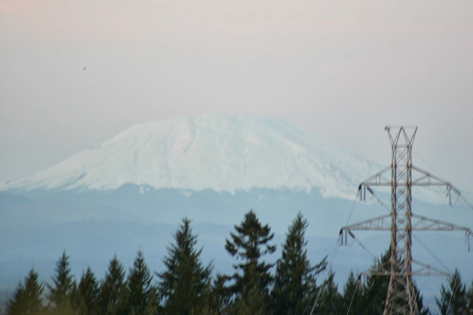 |
| Mt. Hood Original |
 |
| Mt. Hood HDR Edit |
 |
| Multiple Exposure image I took of a tree and changed the colors to black and white to highlight the simplicity of the tree. |
 |
| Street Panorama. In this image I changed the saturation and the contrast to make the image seem as absurd and surreal as possible. |
 |
| Sunset HDR |
 |
| Sunset Image Original |
Monday, March 3, 2014
Cyanotypes and Deguerotypes
Before photos were digitally edited, they were edited using light-sensitive emulsions that would react when exposed to light to change the color of the image. The two most common emulsions changed the color of the image to cyan and sepia respectively. In this project, I digitally emulated these emulsions on photoshop to make the images seem old.
In order to make a daguerrotype a silver-colored plate was exposed to iodine gas which would cause a light sensitive to appear on the surface of the silver plate. The silver plate was then placed in front of the camera and the plate was exposed to the projected image, which would react with the light sensitive layer of the plate causing the image to appear on the plate. Gold chloride would then be added to the image to give it a warmer tone.
In order to make a cyanotype, which was created long after the creation of the daguerrotype, a mixture of Potassium Ferrocyanide and Ammonium iron citrate is painted onto an image. This mixture, when exposed to UV light, turns the image a blue-cobalt color.
 |
| Spider Original |
 |
| Caterpillar Original |
 |
| Caterpillar Cyanotype |
 |
| Flower Original |
 |
| Flower Daguerrotype |
Monday, February 24, 2014
Surrealistic Photography
In this assignment, I chose a collections of photos and combined them to create unreal and dreamlike photographs. I also used textures downloaded from the internet add to the unrealness of the images.


Thursday, February 6, 2014
Surrealism
Surrealism was a cultural and artistic movement that began in the early 1900's. It's aims were to challenge the meaning of reality, and to look at the melding of truth and dreams. The pieces that came out of this movement were often illogical, and nonsensical, often including magical elements. Some famous artists during this time period include Belgian painter René Magritte and Italian painter Giorgio de Chirico.
 |
| Hector and Andromache Giorgio de Chirico- 1912 |
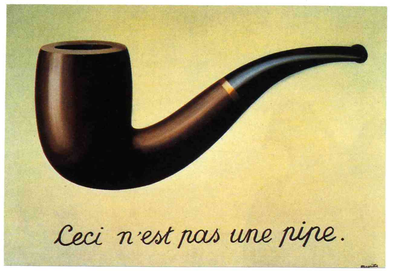 |
| The Treachery of Images René Magritte- 1928 |
Tuesday, February 4, 2014
Photoshop Photography
For this assignment, we learned how to use photoshop to enhance our images using techniques to make Sepia, black and white, and color images solely with the use of photoshop. I chose photos from downtown Portland, and of Lincoln high school. My favorite of the photos is the one featuring a boy lying down in class, which I edited to make him stand out in color, contrasting the black and white background behind him.
Tuesday, January 21, 2014
Final Emulation Project
For this project, I found an image found by an artist I like, and I emulated it. For my project I found an image by the Photographer Reza and emulated it using the same elements of arts as she did in her image, but also putting my take on the picture in to it.

Tuesday, January 7, 2014
Photo Balance
This assignment asked us to find photos that represent the three main types of photo balance: Radial balance, symmetrical balance, and asymmetrical balance. We also had to find photos that showed contrast in size, and texture, and color.
 |
| This is an example of a symmetrically balanced photo, with a bike and a bench on each side, and the water fountain in the middle |
 |
| This photo represent Radial Balance, in which the center of the picture is the most important feature |
 |
This photo represents asymmetrical balance, owing to the mad hatter dominating one side of the photo, whereas the other side of the photo is mostly blank |
Monday, January 6, 2014
Diptychs, Triptychs, and Kaleidoscopes
For this assignment, I used previously taken pictures to create kaleidoscopes, triptychs, and diptychs, using editing to create the desired effects. These photos are focused on a variety of subjects, from downtown Portland, to Washington park.
  |
| I like this flower kaleidoscope because the way I edited it makes it seem similar to infrared |
 |
| This is my favorite triptych, taken of a flower downtown. |
 |
| School time diptych of my friend Alex |
 |
| This bike stood out to be because its brightness greatly contrasted the normal grey and green colors that surrounded it |
 |
| Spider Triptych |


Subscribe to:
Comments (Atom)